As a company that works with over 350 banks and credit unions and is continuously evaluating their websites for self-service best practices, it’s astounding to see how many bank and credit union websites are missing a fundamental element of website UX — a simple yet prominent and easily accessible search bar — with strong on-site search functionality behind it.
What do we mean by that? More often than not, it’s an obvious blank, white rectangular box in the top right corner of a website, sometimes demarcated by the ubiquitous magnifying glass or the word, “search.”
It’s the intuitive spot we’ve been trained by the Googles and Amazons of the digital world to enter a search query, a question, a string of vaguely sensible words — whatever it is that represents what we’re trying to find.
Why is the presence of a prominent search bar so important to retail bank and credit union websites? We’ll share 7 top reasons with you in this blog post.
7 Reasons Banks and Credit Unions Need a Search Bar

1. Banking consumers don’t always know what they’re looking for (or what to call it).
The world of banking is a complex one and, let’s face it, can look and sound like a foreign language to a population that’s only 57% financially literate.
When banking consumers come to your website they may have some vague sense of what they are looking for, or a very specific transaction in mind that they need to execute, but they may not always know how to precisely define it.
The presence of a search bar allows them to search for what they think it’s called, and search until they can find what it is they are looking for.*

*This of course, is only as good and helpful as the quality of the content behind your on-site search engine. We’ll get into that a little more later.
2. Time savings — Search is (perceived to be) faster and easier than navigation
Many websites today are built with either a navigation-based UX, or search-based UX. In a navigation-based UX, the user navigates through content to find what they are looking for. In a search-based UX or search-first model, the user experience is centered around the user’s search query.
Think about the difference between the UX on Yahoo versus Google. Yahoo features a navigation-based UX, with a content-heavy dashboard featuring articles, headlines, media, ads, and widgets. A search bar is present, but is secondary to the content-driven navigation.
Google, on the other hand, features a search-based UX, presenting a super simplistic interface with the search bar as the central focal point. There is no other content, no menus, no carousels or widgets to avert attention from the search bar.
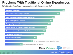
A study conducted by Drift, Survey Monkey, Salesforce, and myclever found that the top two frustrations with online experiences are difficulty with site navigation (34%), and the inability to get answers to simple questions (31%).

The presence of a prominent search bar on websites allows users to immediately enter a search query, rather than forcing them to navigate through menus, carousels, and copious content. When you take into consideration that the average bank or credit union website has 337 web pages, that is a lot of content to expect your site visitors to navigate to find what they need.
Think about it – would you rather search for a needle in a haystack, or have the ability to ask your question upfront and be presented with the most relevant answers?
3. Users expect a search bar
The presence of a prominent search bar (if not central to the site, a part of the main navigation) has become the norm and, frankly, is expected. It serves as a door to your site’s content – one that can be used freely at will by the site visitor to get to the content they are seeking. If not the starting point, it is often a crucial component somewhere along their user journey.
Further, a search bar helps streamline the user experience, design, and feel of your website. There are known benefits to the proportion of white space to content on a site interface. These include improved comprehension, guiding the users’ focus and attention to critical content and elements, and increased interaction rate.
The white space in a prominent search bar is beneficial in and of itself, but if it can also help retain your site visitors’ attention and time spent on site, it’s a win-win no-brainer. Just take a look at the use of white space on Google’s homepage!

4. Search is a cornerstone of fostering consumer self-service
Today’s consumers are on a mission to find information and do it themselves. 92% of online adults use search engines to find information on the web. There are over 30 million active users of YouTube per day. At least 3 out of 4 smartphone users turn to mobile search first to address an immediate need. We are a search-loving culture, and as such, have come to expect search functionality in each of our digital interactions.
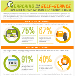
What does this mean for banks and credit unions? It tells us that today’s consumer wants to self-serve. Data compiled by ZenDesk demonstrates that 67% of consumers prefer self-service over speaking to a company representation, and 91% would use an online knowledge base if available and tailored to their needs.

Given the opportunity to conduct on-site search, banks and credit unions have an immense opportunity to present useful and actionable content within the search results that can usher site visitors further down the path of online and mobile adoption. Search allows for consumers to self-service and answer their own questions, which leads us to the next reason…
5. It demonstrates intent and can lead to action (aka leads, conversion)
When someone uses search, they usually have a fairly strong intention behind it. Unless you are mindlessly “googling” or “youtubing” for entertainment purposes (hey, we all need a break sometimes), when you navigate to a search bar you have a clear intent in mind, a problem to solve, a question to answer, or something to find.
There are various stages of search and research (think – the marketing funnel and how search queries evolve as intent becomes stronger) and various search results that are appropriate. In the context of ecommerce, on-site search usage is typically strongly indicative of a ready-to-buy consumer.
In banking, the use of search also indicates strong intent — the user is ready to do something. Maybe it’s to open an account, maybe it’s to sign up for online banking. Why would you leave their money on the table by not allowing them the most simple avenue to find what they are looking to do via a search bar? We estimate there are thousands of missed opportunities per month in banking digital channels because of a lack of adequate support.
6. It will reduce your website exit and bounce rates
What do users do in the absence of finding the information they’re seeking? They say, “buh-bye” and bounce or exit from your site. The presence of a search bar is, at the very least, one final speed bump to encourage them to stay on your site and try to find what they’re seeking.
The absence of a prominent search bar is a missed opportunity to capture leads and conversion.
7. And more…
The reasons why credit union and bank websites should have prominent search bars (and strong search functionality behind it, as well as well-written content to drive great search results) go on, and on. Consider, for example, how a prominently displayed search bar:
- Helps reduce call center volume.
- Allows consumers to self-serve and answer their own questions.
- Improve customer experience and satisfaction by allowing consumers to find answers to their questions on their own terms, in real-time.
- Provides a 24/7 access point to support answers in the absence of live customer service (especially on nights and weekends, when banking website search volume is high, but call centers are closed).
- Helps increase mobile adoption and online banking engagement by providing answers that lead to action.
Can’t have a search bar without search functionality & strong support content behind it
The sheer presence of a search bar is meaningless unless it is bolstered by:
- Strong search algorithms that deliver highly relevant search results, and
- Well-written and structured support answers
What do we mean by the latter? A well-written and structured support answer will not only answer the user’s question or search query, it will provide additional, relevant information, and provide a call to action to further engage the user.
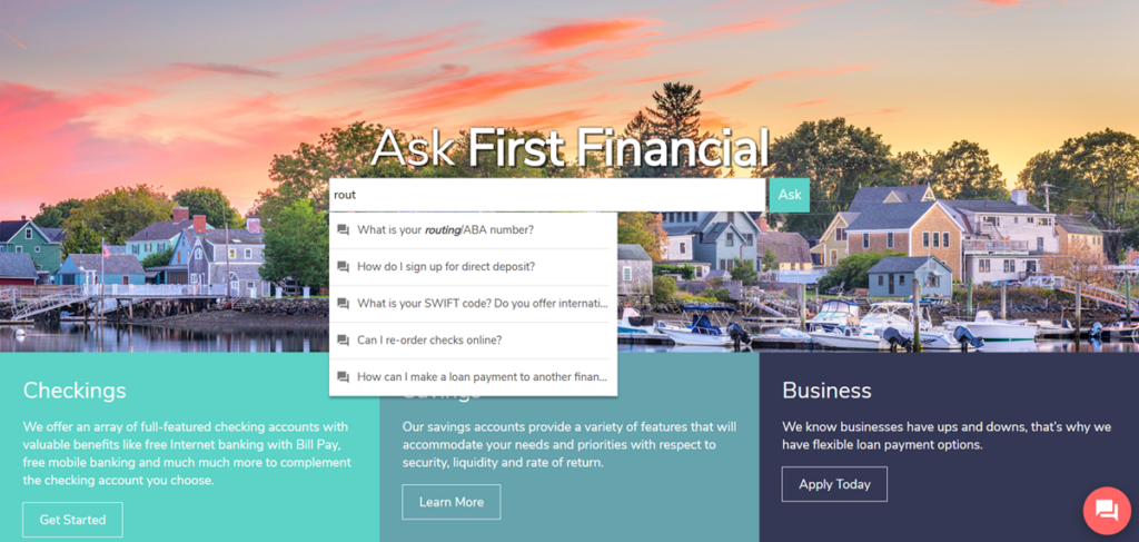
For example, if the search query is “routing number,” a strong search result will explain what a routing number is, provided additional information on how it’s used and where to locate it, and most importantly — suggest next steps to take. In the case of “routing number,” that would be to direct them towards the likely actions of signing up for bill pay or setting up direct deposit.
Where do you stand?
Does you banking website provide on-site search? If so, is the search bar prominently displayed in an easy-to-locate and consistent location? Does it help your financial institution achieve lower call volume, higher online and mobile banking adoption rates, more leads and stronger conversion? If not, you may want to learn more about our Customer Self-Service solution.
Related Resources
- Providing Digital Support as Banking Customers Shift to Digital
- How To Support Your Banking Customers During the COVID-19 Crisis
- 9 Stats Pointing To Why Customers Want to Help Themselves
- Self-Service in Banking: 4 Easy Ways to Deliver the Experience Your Consumers Expect
- 8 Ways to Improve Your Bank or Credit Union’s Customer Service
