A bank or credit union’s website is one of its greatest assets. For most people their first interaction with a bank or credit union is going to their website to learn more about them or their product offerings. This is why it’s important to ensure you have a good website design and are constantly looking for ways to improve engagement and conversion on your bank or credit union website.
A complete overhaul of your website can be a time consuming and costly project. It may typically even involve third-party vendors or additional resources for support. But, there are a few easy things you can do without either to improve the performance of your banking website. We’ve outlined 5 simple website improvements for banks and credit unions that will make a difference without the hassle
5 Simple Website Enhancements for Financial Institutions That Don’t Require a Complete Website Overhaul
1.Create an FAQ’s Page
Creating an FAQ’s page is one easy thing you can do to improve your website and customer experience. This enables your customers or members to self-serve instead of having to call into your contact center or visit a branch.
Although it may seem like a large task, it doesn’t have to be. You can create a simple web page that lists common questions and your institution’s answers.
Start with the typical banking questions such as routing number, hours, and where to find account number information. Next, find out specific questions your customers or members frequently ask by working with your call center and branches to develop a broader FAQs list.
A FAQ’s page doesn’t have to start out as an extensive list. Begin with the top 10 questions you receive in your contact center. Remember that the most important part is providing your customers with the answers they are looking for. You should continue to add new FAQs using insights from the contact center and branches. Check out these frequently asked questions surrounding COVID-19.
2. Provide Self-Service Options Before Contact Information
Consumers want to self-serve. In fact according to a study done by ZenDesk, 67% of people prefer self-service over speaking to a company representative.
However, most banks and credit unions don’t make it easy to self-serve. We analyzed over 100 banks and credit unions between $500M and $1.5B in assets and found that just 6% have easy-to-find FAQs and 100% direct site visitors to call their call center.
In order to provide not only a better customer experience but to help reduce call volumes, put your support answers before your institution’s contact information. This enables your consumers to easily find the solution to their question on their own or contact you if their question isn’t answered.
On your Contact Us page, instead of only listing your contact information provide support information such as a search bar, list a few top FAQ’s or just link out to your FAQs page.
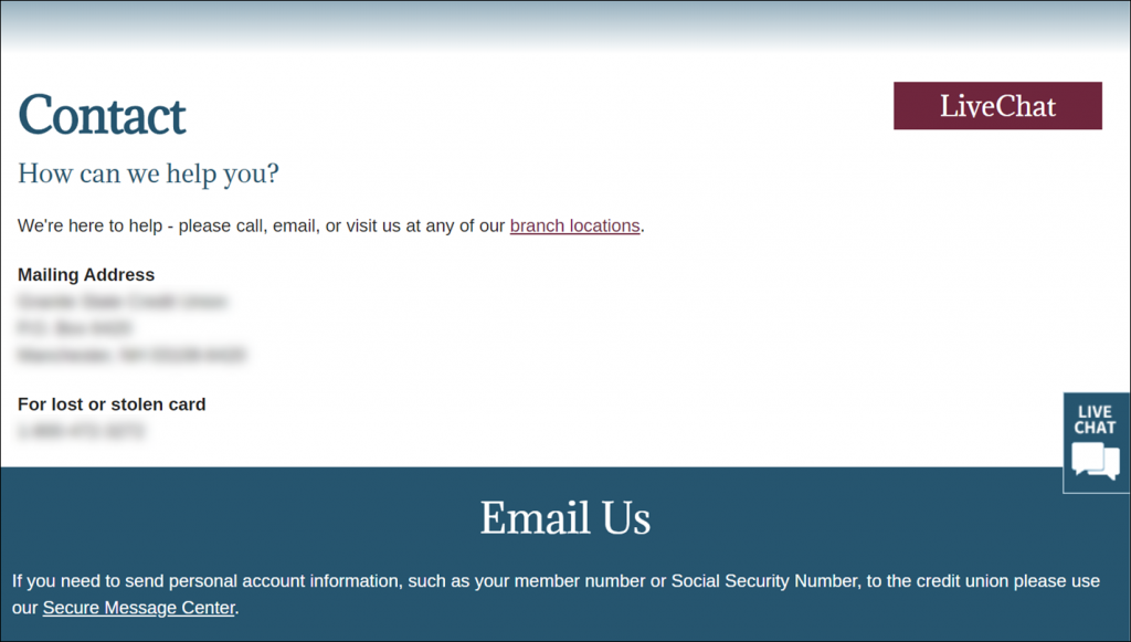
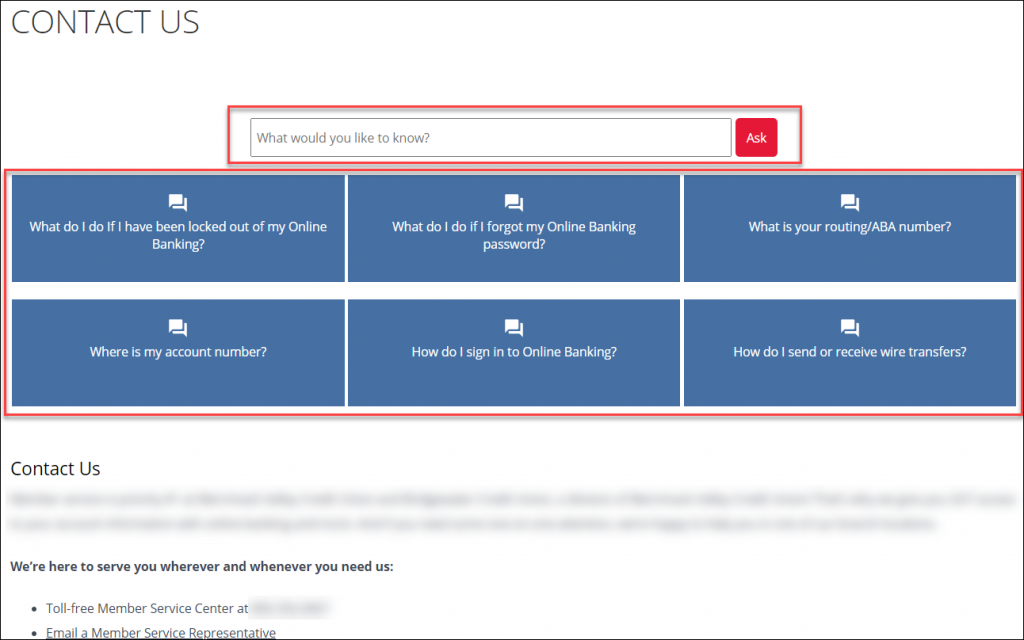
Here is an example of two credit union Contact Us pages. The first leads members to call, email or chat if they need help. The second offers immediate self-service support as help but also offers their contact information if someone prefers to call or their question wasn’t answered.
Example 1: Directing page visitors to call, email or chat
Example 2: Directing page visitors to self-service options
3. Create Product Comparison Charts
Banks and credit unions have many variations of their product offerings whether it be checking accounts, savings accounts, loans, or credit cards. From a consumer perspective it can be overwhelming and difficult to decide which is the right account or loan for their needs.
Make this process as simple as possible for your consumers by creating product comparison charts for each type of product your bank or credit union offers. Rather than jumping back and forth from the different savings account pages, the consumer can easily view the features of both and determine which is likely a better fit.
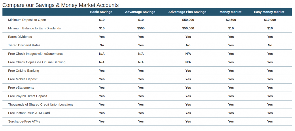
Here is a simple example of a savings account comparison chart. It provides a quick way for consumers to find the right account for them.
4. Clear Call to Actions
Improve conversion rate on your bank or credit union’s website by using clear and frequent calls to action(CTAs). A call to action is usually a button or link that tells the visitor what to do. A few common examples are: Sign Up, Learn More, Register Now.
When placing CTAs on your pages make sure they are not only clear (what action should they take now) but that they stand out.
If you are using a button or hyperlinking text as a CTA then change the text size and color to ensure that it doesn’t blend in with the surrounding text. Studies have shown that different CTA colors and even phrases perform better than others so make sure to test different versions.
Product pages are especially important for CTAs because the page visitor has already demonstrated interest in the product by viewing that page. Having the CTA in multiple places throughout a longer page can be helpful for the visitor and increase conversion. Typically there is a CTA at the top of the page and one at the bottom so when a visitor has finished scrolling through the information, they are encouraged to take the next step.
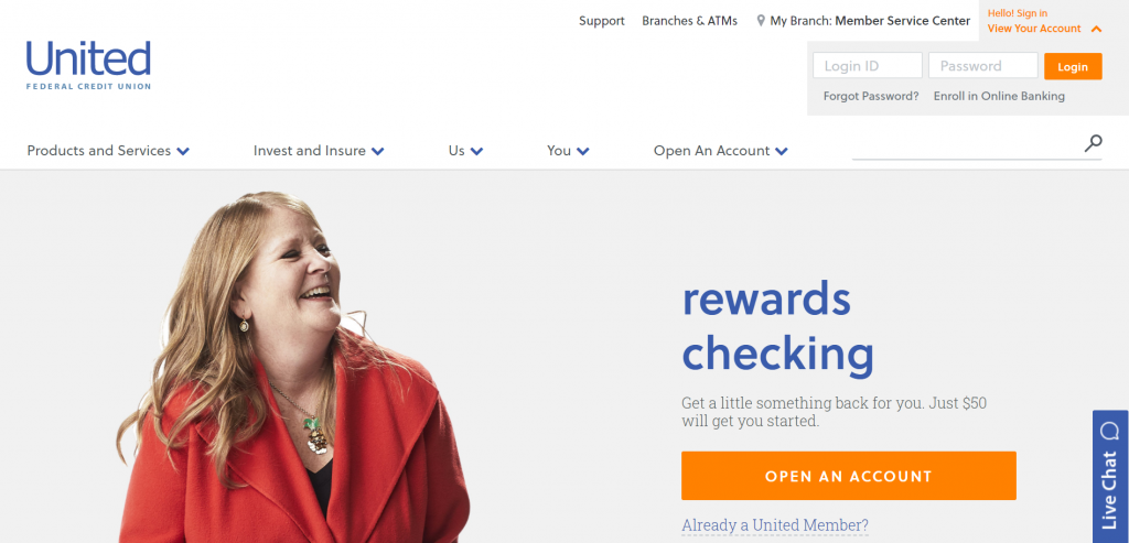
United Federal Credit Union uses multiple CTAs throughout their checking account page that draw the viewer’s eye compared to the text around it.
5. Publish Helpful Content
Publishing helpful content such as blog posts and resources on your bank or credit union’s website will help bring in additional website traffic from potential customers as well as provide added value to existing customers.
Another benefit of posting content such as financial tips or loan calculators is that it allows you to promote your institution’s offerings. Adding a simple CTA to learn more about your loan rates can help direct your target audience from an auto loan blog post to your auto loan pages.

Using downloadable resources such as ebooks or financial quizzes can be a great opportunity to collect email information from website visitors so you can keep them up to date with your latest offers and promotions.
Bonus Tip: Make Search Bar Noticeable and Universal Across Your Website
Your search bar should be prominently displayed (and fully expanded) in the top center or top right of the webpage. Many people start with search to find what they are looking for so providing easy access across your website helps your visitors find what they are looking for faster and easier.
A bank or credit union’s website is one of its most valuable assets so it should be constantly improving. Simple enhancements like these are things you can do without a major website overhaul or complete redesign to improve your website performance and overall user experience.
At Engageware we help 400+ financial institutions revamp their digital channels with helpful tips like these, plus content management, and streamlined delivery of knowledge. Take your customer experience to the next level with 24/7 automated support across all your digital channels. Learn More about Customer Self-Service
Related Resources You’ll Love
- Providing Digital Support as Banking Customers Shift to Digital
- Staley Credit Union and Engageware Deliver Digital Support to Members’ Fingertips in Less than 30 Days
- Why Every Credit Union and Bank Website Needs a Prominent Search Bar
- Self-Service in Banking: 4 Easy Ways to Deliver the Experience Your Consumers Expect
- The Best Customer Service is Self-Service: 9 Stats Pointing To Why Customers Want to Help Themselves